PolicyPilot Landing Page
The Challenge
Transforming complexity into intuitive, performant action.
While the backend dashboard handles complex insurance and policy workflows, the consumer landing website focuses on B2B storytelling: what PolicyPilot does, who it’s for, and why it matters. The challenge lay in translating complex insurance technology and regulatory systems into a clean, modern, conversion-focused layout that feels reassuring and trustworthy to high-stakes decision makers.
The Solution
Art-directed styling meet enterprise structural scale.
We designed a complete product promo landing page built on absolute clarity and structured modularity. Utilizing spacious layout rhythms, a calm and confident color palette, custom illustrations, and uplifting call-to-actions, we evoked visual safety and safety-of-mind. We packaged the final website as a fully reusable, component-based system inside Next.js for rapid iterations.
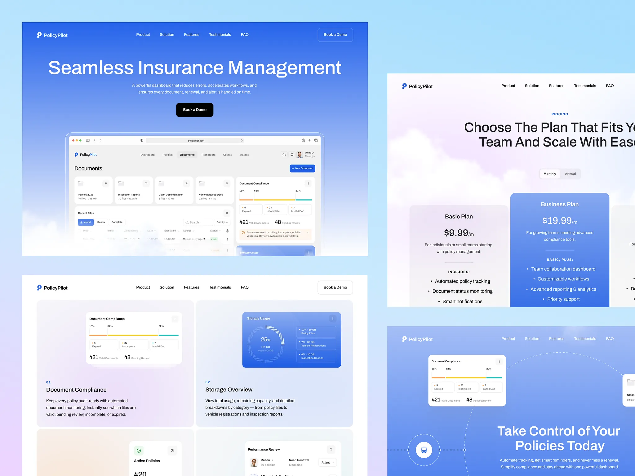
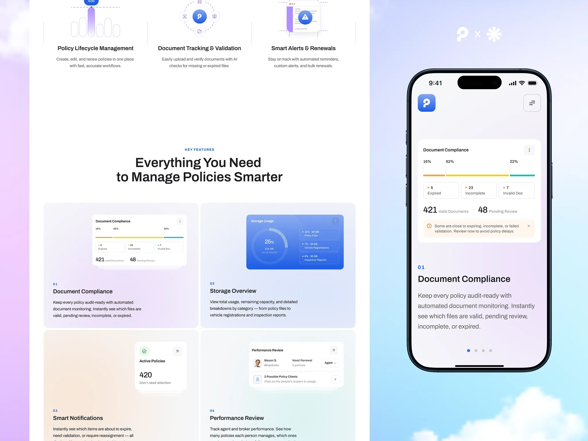
Streamlined Design for High-Stakes B2B Decisions
We crafted a clean, structured layout that reflects the precision and reliability behind the PolicyPilot platform. No clutter, no gimmicks — just a modern, trustworthy interface that speaks to insurance teams, brokers, and decision-makers. Each block is designed to guide users through key features and benefits with clarity and intent. Typography, spacing, and microinteractions were fine-tuned to create a confident, tech-forward experience that supports the brand’s voice and drives product interest.
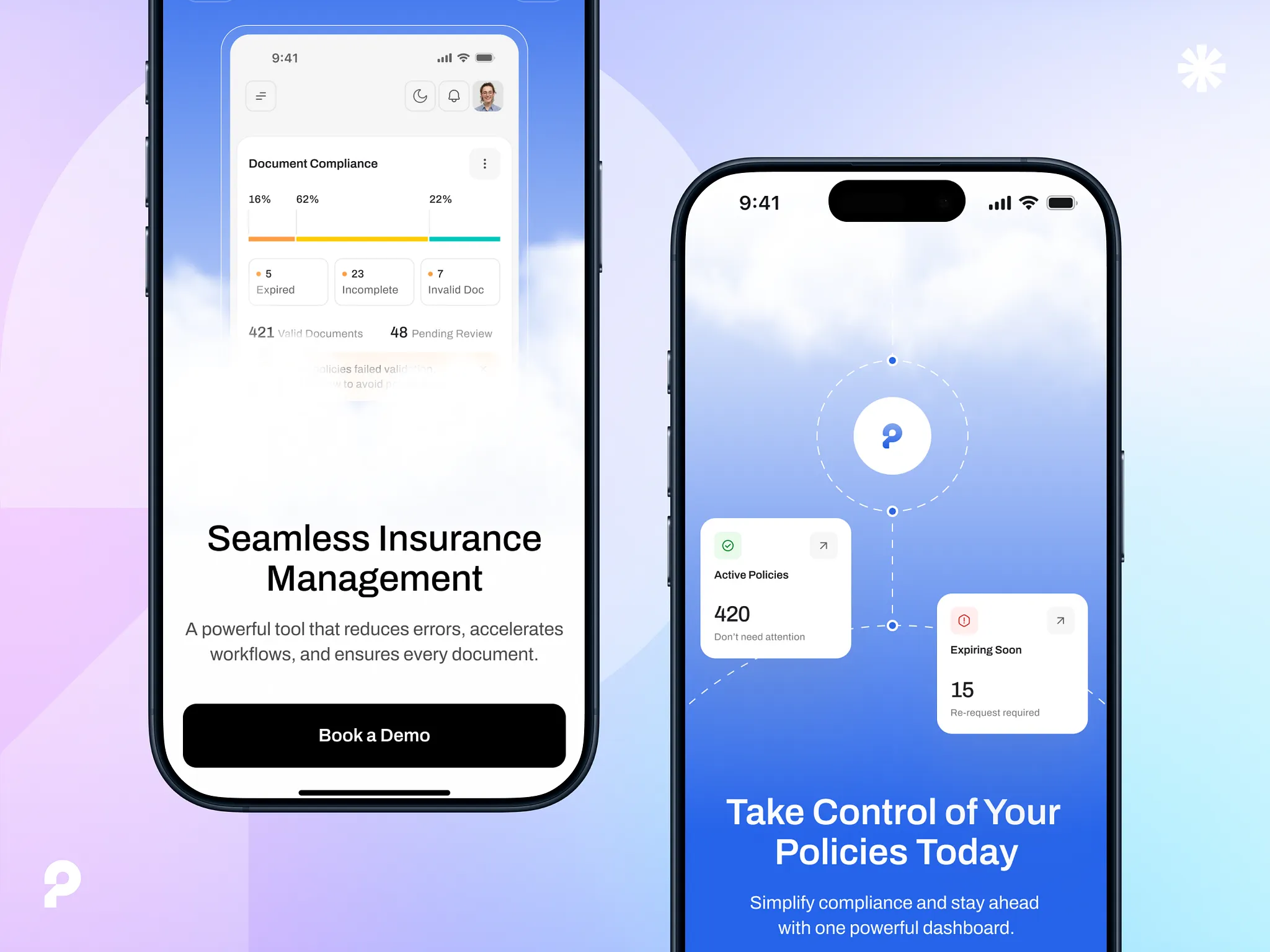
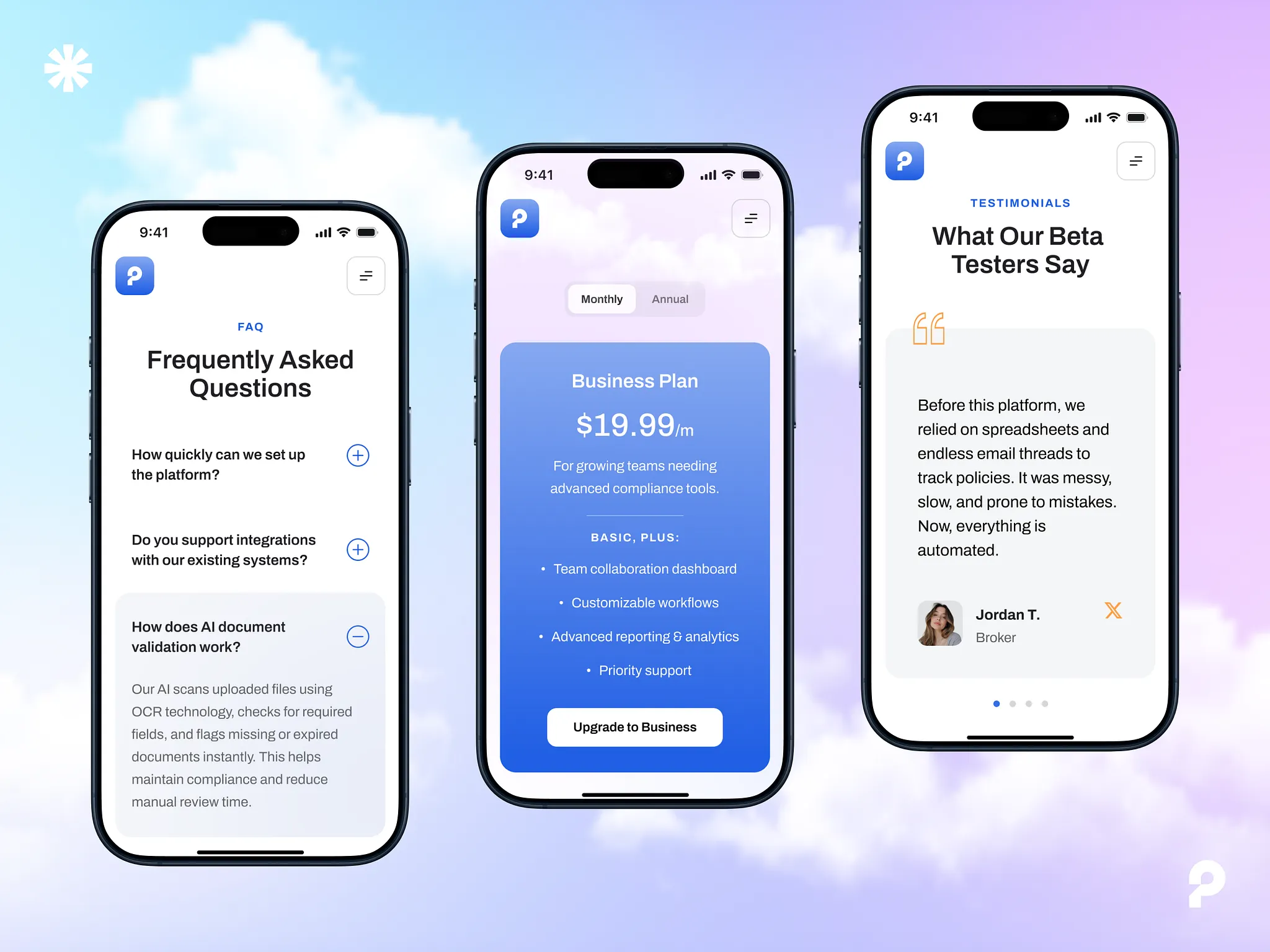
Mobile-First Layout for On-the-Go Decision Makers
We designed the landing page with a mobile-first mindset to ensure fast, seamless access across all devices. Key content blocks adapt fluidly to smaller screens, preserving clarity, structure, and conversion focus — even on the move. Critical interactions like demo requests, feature highlights, and benefit visuals remain intuitive and tappable. Thanks to lightweight assets and responsive scaling, the experience stays smooth for busy admins, agents, or partners checking out the product on phones or tablets.
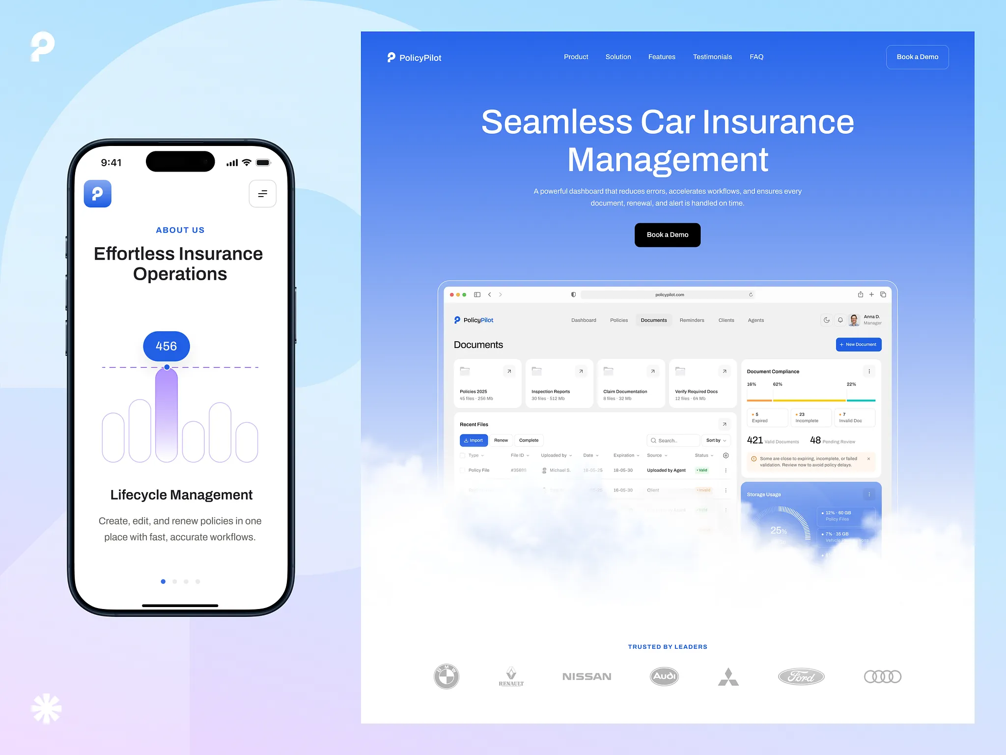
Vibrant Visual Style to Stand Out
To give PolicyPilot a distinct brand presence in a competitive B2B space, we introduced custom illustrations and a bold color palette in key content blocks. These visual elements don’t just decorate — they differentiate, helping the product stand out and feel memorable without overwhelming the user. The structured Achivo font brings clarity and rhythm to each section, balancing the expressive visuals with confident, easy-to-read typography. The result is a polished identity that supports trust while reinforcing PolicyPilot’s modern, tech-savvy positioning.
Uplifting CTAs with a Sense of Safety
To reinforce trust and inspire action, we crafted concise, emotionally resonant call to actions across the site — each one tied to the core theme of clarity and protection. The visual metaphor of open skies and soft clouds evokes safety, transparency, and peace of mind — qualities users naturally associate with well-managed insurance. These cues aren’t just aesthetic. They build a consistent emotional tone across the landing page, aligning user expectations with the product’s value — a structured, calm, and reliable solution for policy management.
Component-Based Layout for Scalable Flexibility
To streamline development and keep future iterations agile, we built the website using a fully modular component system. Every element — from pricing cards to feature blocks and testimonial sliders — was designed as a reusable unit. This approach allows rapid updates, consistent visuals, and easy expansion as new product features emerge. Each section is composed of interchangeable blocks, enabling us to A/B test layouts, scale content for new target segments, or adapt the landing page for campaigns — all without touching core code. It saves engineering time, simplifies collaboration, and ensures the site evolves along with the product.
Related Reading
Articles that unpack the strategy, design, and engineering behind this case study.
Browse other concepts
View all worksZeBeyond Simulation
Introducing ZeBeyond — an advanced simulation platform helping engineers make smarter powertrain decisions before physical prototyping. The UX translates complex engineering data into a navigable, decision-friendly interface.

Personal Branding – AX
A clean, premium personal visual identity transformation and personal branding design system built on custom geometric ambigram marks, deep dark tones, and vibrant red accents.
Have something meaningful to build?
We partner with teams who care about craft. Let's talk about what you're building.