
Personal Branding – AX
The Challenge
Transforming complexity into intuitive, performant action.
Decided to spruce up my logo and gave my brand a whole new look while I was at it. The primary challenge was to engineer an identity system that bridges the boundary between a highly personal vector mark (the AX ambigram) and a commercial, top-tier design consultancy positioning.
The Solution
Art-directed styling meet enterprise structural scale.
We created a premium personal branding ecosystem centered around the AX ambigram mark. By combining a bold, high-contrast color scheme, customized physical stationery blocks, and a micro-animated digital presence system, we delivered 100% brand coherence that establishes an authoritative professional identity.
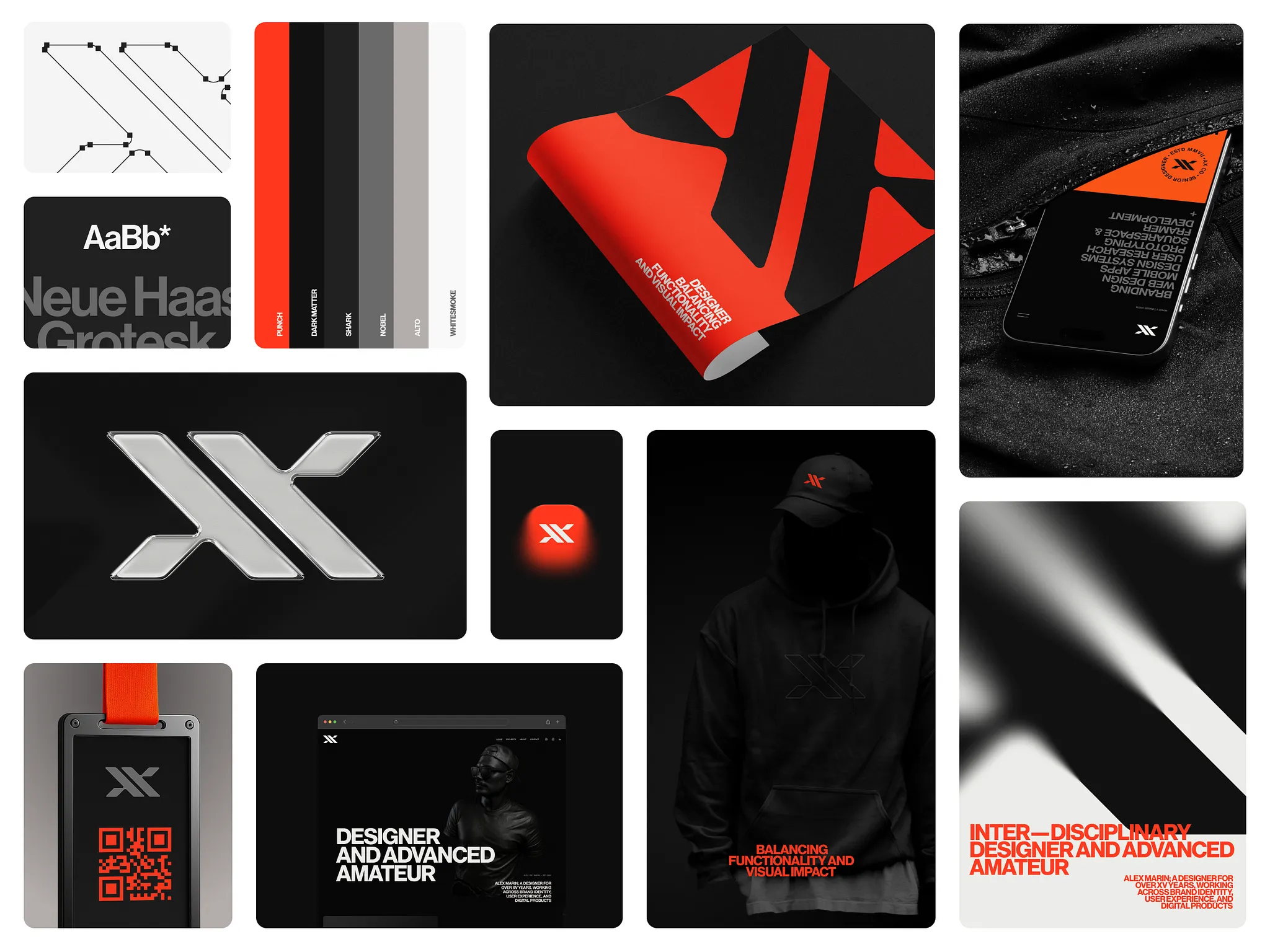
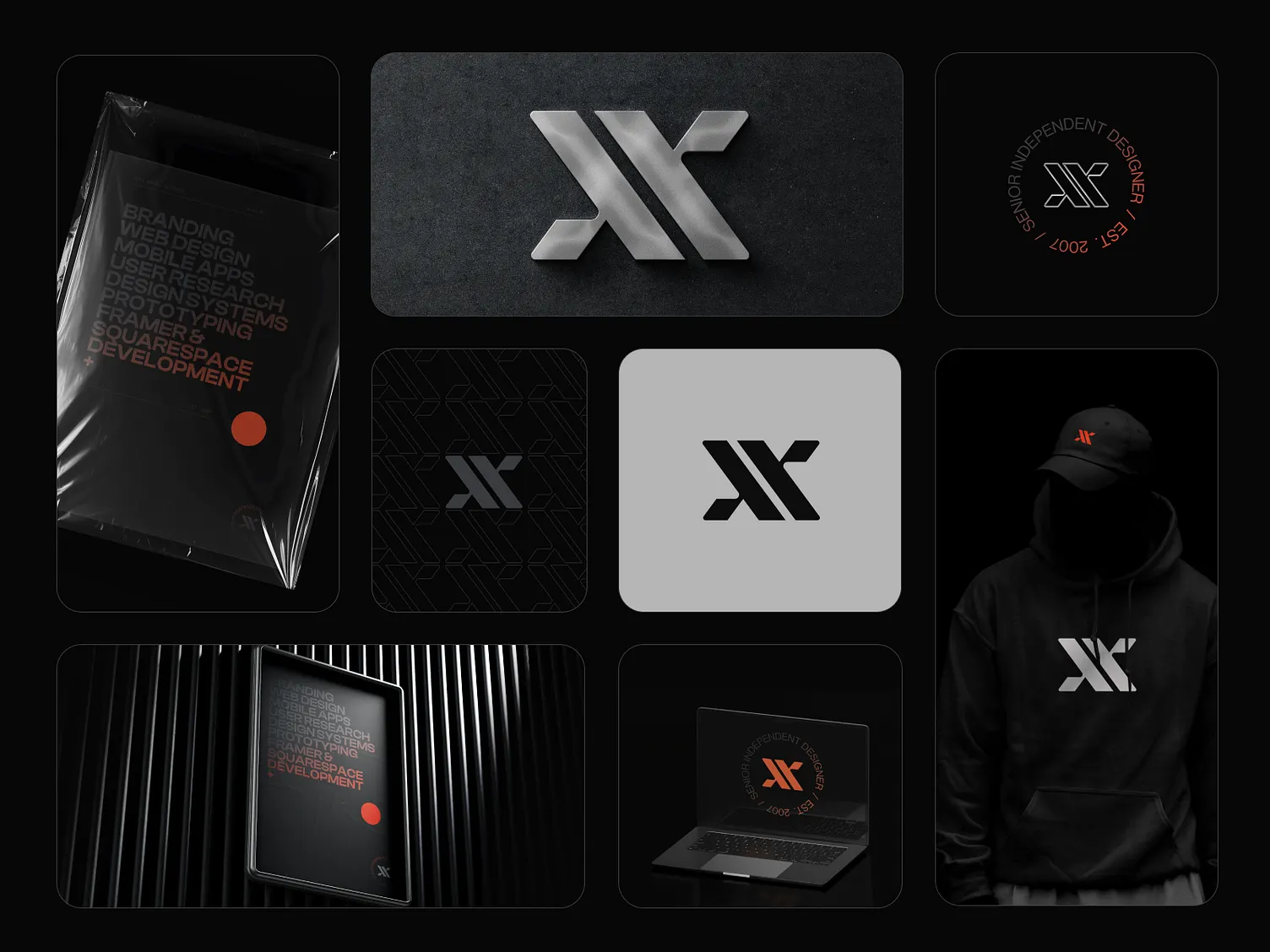
The AX Ambigram Emblem
The AX emblem is designed as an ambigram, derived from my name, ALEX. When viewed from a distance, it morphs into an X, symbolising precision and focus towards targets. The alignment of vectors, symmetric scaling, and weight distribution were meticulously fine-tuned to ensure that the mark remains instantly legible and striking, whether printed as a tiny favicon or displayed across large outdoor banners.

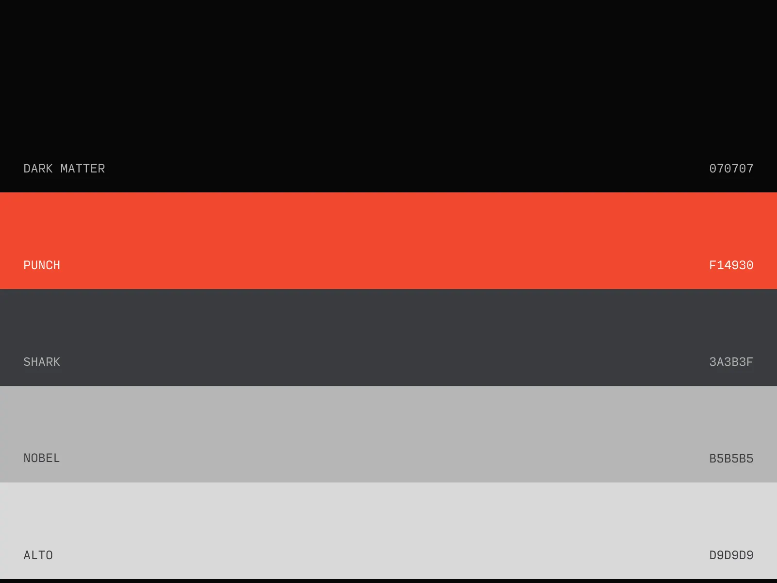
The Red Accent & Passion
The red accent symbolises courage and passion, reflecting changes that drove me towards recently becoming an independent designer. This energetic red tone doesn't just act as a highlight; it represents the fuel and momentum behind every creative project. By contrasting this vibrant red accent with deep matte darks and clean whites, we built a modern, high-contrast palette that conveys confidence, ambition, and creative authority.

Typographic Scale & Architecture
To balance the expressive geometry of the AX ambigram, we established a robust typographic system built on structured rhythm and premium font hierarchies. Utilizing clean sans-serif typefaces with high-contrast tracking and bold vertical heights, the personal brand guidelines guarantee seamless scannability. This structural rhythm allows the brand’s voice to remain both highly conversational and authoritatively professional across all mediums.

Grid-Aligned Stationery & Mockups
A premium identity is only as strong as its execution. We extended the AX visual identity into high-end physical stationery, including custom-textured matte business cards, embossed letterheads, and grid-aligned presentation decks. Every piece of stationery follows a strict modular grid system, ensuring that whitespace acts as a key design element, letting the bold red accent and symmetric emblem command attention.

Digital Presence & Interaction Language
In the digital sphere, the AX brand comes to life through fluid, micro-animated interactions and a seamless dark mode aesthetic. Utilizing smooth transition curves, clean container layouts, and responsive vector scaling, the digital experience mirrors the precision of the physical brand mark. Every hover action, scroll trigger, and page exit is designed to reinforce the central themes of clarity, focus, and modern design precision.
Additional Brand Components & Coordinates
Related Reading
Articles that unpack the strategy, design, and engineering behind this case study.
Browse other concepts
View all worksZeBeyond Simulation
Introducing ZeBeyond — an advanced simulation platform helping engineers make smarter powertrain decisions before physical prototyping. The UX translates complex engineering data into a navigable, decision-friendly interface.
PolicyPilot Landing Page
A conversion-focused promo website built to present a powerful B2B insurance admin platform with absolute clarity, spacious modular layouts, and trustworthy styling.
Have something meaningful to build?
We partner with teams who care about craft. Let's talk about what you're building.